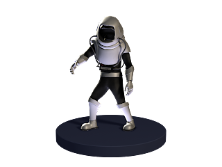
Nearing the deadline in showing our trailer my group decided to give the characters who won't be moving much only arm, spine and head control while the rest will have full body control with IK to FK Switch, the IK's are represented by triangles while the FK's are represented by Squares. All the characters have blend shapes ranging from mouth movements to eyebrow movements.
General
Scientist
Assistant
Astronaut FK Rig
Astronaut IK Rig
Soldier FK Rig
Soldier IK Rig
Generic Male FK Rig
Generic Male IK Rig
Generic Female FK Rig
Generic Female IK Rig
Monday, 24 January 2011
Sunday, 23 January 2011
Making of: The Invisible Cannibals from Beyond the STAR!
Here is the 'making of' for our movie, it will cover the models we have made from the props to the characters. It also will talk about the theme of our film and the modeling and rigging techniques we used.
'Making of'The Day of the Invisible Cannibals from Beyond the STARS!
Saturday, 22 January 2011
The Last Four Turnarounds - All in full Colour
Here are the last four turnarounds, completing the set of seven characters, and all viewable for the first time, in colour!
The Generic male and General were modelled by Shahbir, and the other two by Ruben. They were all textured by Ruben and all lit and rendered by me, Ethan, i.e. A Flock of Pixels.
Now all that is left for B3D Studios to do is actually complete the trailer as it should be. That's it for now.
A Flock of Pixels.
Friday, 21 January 2011
Three Character Turnarounds
The narrative project has ended, and I now have some time to upload some of the character turnarounds.
All three of these characters were modelled by me and textured by Ruben.
The other four will be uploaded tomorrow.
A Flock of Pixels
All three of these characters were modelled by me and textured by Ruben.
The other four will be uploaded tomorrow.
A Flock of Pixels
Three Rendered Stills
Here are three stills from our trailer.
Notice St Paul's Cathedral in the background of the second still. This is what it would have been like in the final trailer. Unfortunately due to running out of time, the backdrops were not added in the original release.
Sadly, a few other shots were either cut down or missing from the official handed in trailer.
Some time later on, we will re edit it to the complete extended edition as it wont truely be a completed project for us until it has all the scenes done properly. Who knows, we may even release a colour copy too.
The Invisible Cannibals from Beyond the Stars- Lost Footage Trailer
After a few nights of non sleeping and trying to get this trailer out there completed, we weren't able to deliver what we expected of our trailer, which is really frustrating for us because we have been working so heard and passionately to get this done. However, my colleague Aflockofpixels quickly edited a 1st version of the trailer, in which is missing footage.
Apart from what happened we have received some positive feedback on the scenes which made the trailer.
Here it is:
What is left now and to clean our conscience is to make the final trailer happened, because all the work put into it at the moment seemed to be wasted in vain, with everything rendered only the post production stage is missing, which means put the rendered scenes in a timeline accordingly with the sound effects.
Also to clarify, here are the cityscape shots that should be featured in the beginning of the trailer, however werent edited in, although these are stills, the version that will feature the final trailer will be fully animated as they are.
Alongside the trailer, we created a DVD case and Disk template for our animation.
Apart from what happened we have received some positive feedback on the scenes which made the trailer.
Here it is:
What is left now and to clean our conscience is to make the final trailer happened, because all the work put into it at the moment seemed to be wasted in vain, with everything rendered only the post production stage is missing, which means put the rendered scenes in a timeline accordingly with the sound effects.
Also to clarify, here are the cityscape shots that should be featured in the beginning of the trailer, however werent edited in, although these are stills, the version that will feature the final trailer will be fully animated as they are.
These shots supposed to be from maquette so the level of detail is minimal, and most of the things painted by brush.
Alongside the trailer, we created a DVD case and Disk template for our animation.
Thursday, 13 January 2011
Poster concept sketches
After having a month of not being able to access softwares to input towards this project, I return with the teams kind understanding and acknowledgement of the situation I was in. Therefore I have been appointed to mainly deal with the marketing of our trailer - posters, t-shirts and other such ways of promoting to a potential audience.
Here are some images I used as visual reference:
After observing the trends within these images I decided to try to roughly sketch out how it could be applied to the day of the invisible cannibals from beyond the stars. I would rather the poster be more simplistic than overdone, a few basic stand out images with a single tone background.
This first sketch was just an idea which I dont think works for the film, but is interesting so I thought id post it anyway. It shows one of the Cannibals faces (of which we dont see in the film) with scars and blood, however his face also is held within an image of the Earth, which represents the threat the cannibals have of invading it. This "world" would also be placed as the visor of a spacemans helmet, so it would be somewhat of a three peice structure behind one image.
After this I decided to follow the more traditional poster look, with a simple design yet retro feel. I decided on a few key aspects of the film which could be used effectively as an image on a poster. This first one is a spacemans helmet, sitting in a pool of blood. I thought this described the moment when the cannibals take off their spacesuits to become fully invisible and start attacking innocent humans.
This poster is based on the structure of the poster above, however with a different key aspect of the film which gives impact of what to expect. You can see the crashed spacepod, with an astronaught walking out of it and a man running away in fright. I have also started using a line stating the film is coming soon, any suggestions on what could be used are welcome as my lines pretty cheesy.
This next image is far more typical to the 1950's horror movie poster - the subject of the female being weak and in need of some kind of heroic assistance, indulging in the subject of how gender equality has changed over the years.
Last up is the most daring and probably unfavourable image that came to mind, which is based on the visual refrence of the film "Aliens" and uses understanding of how they worked with their inhumane ways of eating their prey.
Chris
Subscribe to:
Posts (Atom)