Today I was designing the look of our poster for our film to help advertise it better. The main theme for our poster is to mimic the 1950s way of advertising a film.
On image 1 are the many designs for our poster. On image 2 I chose the top left corner design where the Astronauts are walking down from their pod and the casts of the film look in terror.
On image 3 I was designing the different pose our cast would be in for the poster.
The last image I talked to Ethan and he gave in his idea which was a type of zig-zag effect looking from the pod to the astro to the cast. I still need to work with Chris on this but I an very exited on how our poster will look.
Here is the final designs for either the business card and the forum banner, the business card will identifies and promote as a studio, not using internet.
Front
Back
And the final forum banner, where via forum we will publish our project for the CG Society.
For our business card we were going for a more cool looking design which some what matches our new logo, instead of matching our film. The reason for this idea is so we can advertise our company and not the projects we are working on.
The information on our business card is on the second page of the card. We only chose the necessary info for example name, occupation and email address to our studio.
First page
Second page
Once we have finished our business card it down to me to design our web banner. For the web banner I was trying to match the design of our blogger theme by colours to show that the banners does belong to us. I have made some other design just in case we are not going to match it to our blogger theme colours.
The first design is more simplified telling to public our studio name and blog address.
The second design is some what the same as the first design but wit our old logos at the side.
The third design has the same colour theme as our blog theme but has big letters and logo. This design main focus is being clickable than letting the public typing the web address.
The last two are the same as the first two designs but with only the color grey. they were meant to animate but decided to leave hem with a simplified feature instead. However I will animate them soon, letting it show the project we are working on and going back to show them the web address.
We were thinking that maybe the logo needs some sort of character to accompany it. We had a rough idea that it would be a simple robot, so I sketched out a design.
I also did a quick simple model of it too.
OK. It's kind of obvious we've taken some influence from Wall E, but we all agreed that we liked it.
I wasn't joking when I said it was simple. The antenna will always be curled forward when at rest. As you can see the simplicity of the model didn't allow that, but if it were to be rigged, I'd need it flat.
The idea is that it is on one wheel, has two lose arms and an antenna that sway back and forth. (No force other than momentum is controlling them.)
All the robot can control is the wheel. I'm not quite sure how it is going to fit into the ident for the logo. It may be that we have several versions of the ident. A short ident with no character and an ident that lasts longer with the character.
The robot doesn't even have to accompany the logo necessarily. Not on banners anyway.
OK. To be honest. I'm looking at this character now, and I'm thinking, hmmm. Is this the right character? Not quite. I don't think we should rush to get a design done now because I really don't know how this character will fit into the animation. It may just be that the shape needs altering a bit, taking more styles from the logo maybe.
Well I'll see what you think.
One of the ways of advertising our company is to make business cards. I have looked at different types of cards and made an influence map out of it.
I have found this helpful because it gave me some ideas to make our cards look fun and professional.
I have made some different designs for our business cards, but they mostly carries a metallic appearance to fit with our logo. I used myself(Shahbir Hameed) as a subject to fill out the necessary requirements for our business card.
The first business card has a silhouette of our logo and a faded text which I feel enhances the metalness effect of the card
The next card was to experiment with one card with one colour and and one with two colours to give our card more variety.
The next business card is meant to be as straight forward as possible, telling the people the name of the studio. Although looking back I believe it would be more effective if I added the information of our studio at the back
The next card I wanted to try something different, having our card information done in a horizontal manner. Most of my team approve of this for being different so I might make some more designs around this decision.
The last card is also done horizontal but this time with the group logo on the first page of the card and the information on the second. this wasn't too well received by the group because the loge on the first page was too big.
I'm still working on the card design but focus mostly on making them horizontal since that was a good idea, but that doesn't mean I can't stop experiment on the design.
Today I decided on having a break from sketching and decided to turn our logo from a simple Photoshop image into a fully three dimensional logo. After all, we are B3D!
So I went into Maya and modelled the logo. I then done a simple animation, lit it, shaded it, and rendered it. Although I rendered some of the elements separately so I could further mess around in After Effects.
I have here two versions to show. Both don't have sound.
The first is the final render, which I composited together into it's simplest form.
With the second version, I have made a few slight adjustments.
Such as a curves adjustment as I thought that it needed to be slightly brighter. I also added and animated the glow effect. Not sure whether this is needed, but I put it in anyway. The last difference is that the logo separates from the background at the end.
That's it. I could have done all kinds of combinations. (With or without glow. With or without the logo separation. Whether it should it be brighter or not. etc)
Please comment on what you like and dislike about these test idents. Whether it be a slight change in camera angle or a colour change.
One thing I did notice about the angle of the logo is that the left side of it is not visible. So the only time it really looks 3D is before the 3 covers up the inner right side of the logo. I kind of like that though, especially in the second example, where the logo separates at the end. It looks 2D again. Of course if you think it should be 3D all the way then comment by all means. I just know that a lot of 3D logos have a 2D version as well.
I'll end by saying that Ruben and I also discussed about what kind of character to include with the logo and also how it could animate.
We were thinking of a simple little robot on wheels. In the ident, we thought that maybe the 3 could get stuck half way between the B and D. Then the robot could come along and push it the rest of the way. Although we're not quite sure where the robot would go next. Whether it be off screen or stay next to the logo somewhere.
The other types of marketing for our film is that we are using the Internet to promote our movie since the Internet is recently the main source to find entertainment and updates on other media. So to constantly keep our public interested and updated on our film we made accounts on certain community websites. These websites are Youtube, Facebook, Twitter, OneTrueMedia CGSociety and our main source for updates Blogger.
Other ways of getting our public more excited for our film we are going to make some badges, coasters with bite marks on them giving off the idea that an invisible monster has ate a bit of the coaster, mugs, key chains with the astronaut on it and a see through plastic astronaut and spacemen helmet piggy banks. We are also making some business cards to help promote our company further.
To make our poster more effective we decided to research old 1950's sci-fi posters to see how they look and what effect it has when people look at it.
The majority of the posters in the 1950's always have the monsters carrying a woman in their arms while looking threatening and have the public look so tiny in comparison, making the monster more dangerous. The posters also has the same layout of having the monster at the top of the poster and have the people or the cast of the film at the bottom. Also most of them have the same dark and spooky colours to make the film more attractive, as shown in the last five images.
However there are some posters that does a slight change to the layout. For instance Invisible Invaders has a bunch of flying saucers attacking the city from the sky while one man is firing at them and the cast are at the bottom. The only difference it has compared to the other posters is that there is no woman being carried by the monster and it has a man fighting the flying saucers which gives the feeling of hope for our survival.
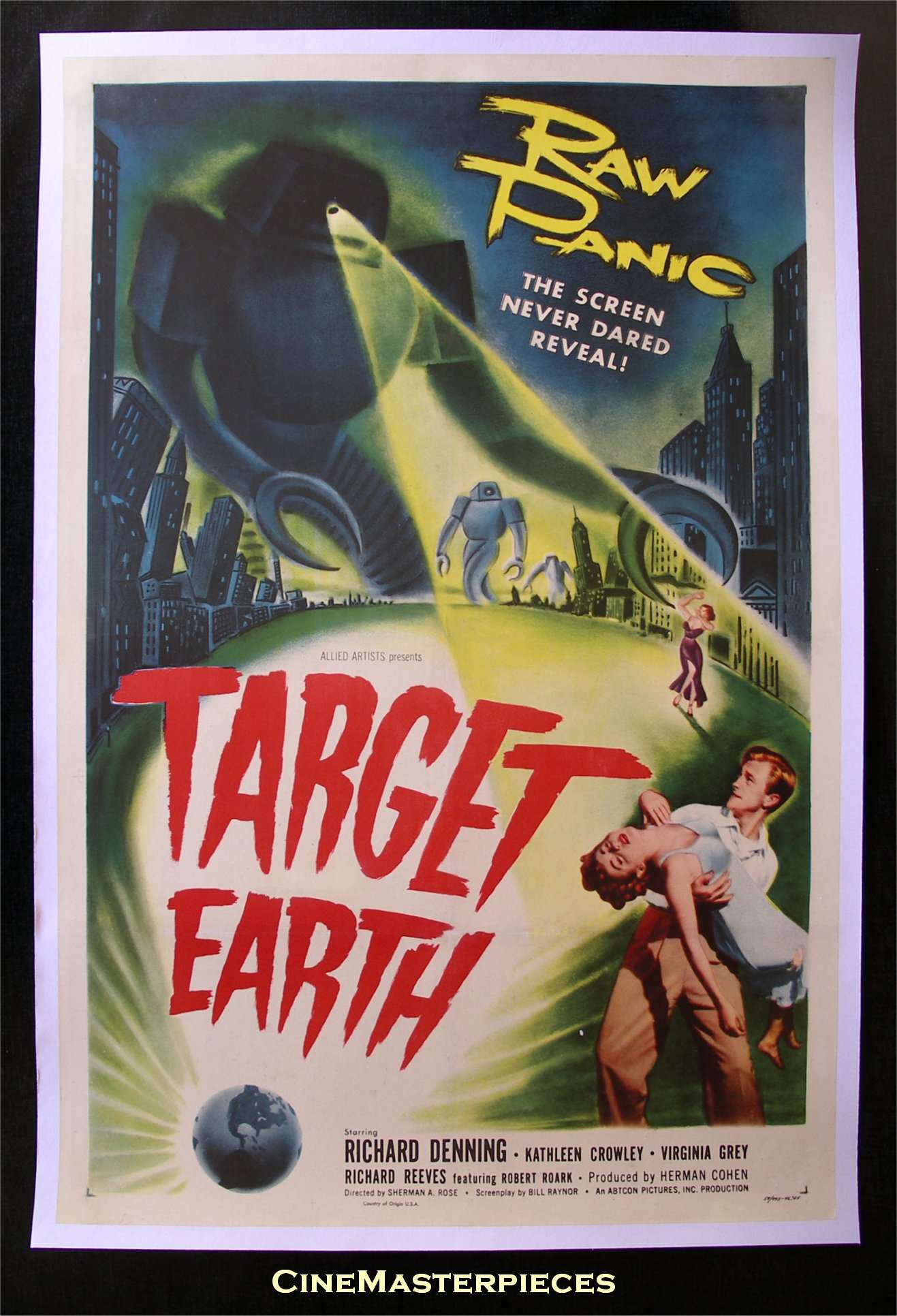
The next poster we are examining is Target Earth. In this poster it still has the frightening monster attacking the people from the the top but this time at the bottom of the post a man is carrying the woman instead of the monster carrying her. It still carries the sense of fear like the previous posters and it works well when seeing a man running to safety with the woman in his arms.
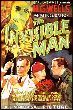
The next poster is very different from the other posters but it still has some of the same characteristics, like the monster at the top and the casts at the bottom, but if you pay attention to how the poster is layered out you can see a trail of smoke coming from the test tube hinting out who is the monster and whats going to happen. Instead of being an invasion film it comes off as an experiment gone wrong film.
The last poster we are viewing is The Quatermass Xperiment poster. This one is very simple, its has a collage of paper, the colours are solid and the writing is simple as well. All of it is simple and yet I believe it still has a spooky appearance with the eye staring at you and how the circle is highlighting the figure with red you can't help but sense a hint of danger from it.
By looking at the poster I now got some understanding of creating our own 1950s poster, by giving the monster a larger than life feel and using the right colours giving it the scary appearance and an attractiveness to lure the audience in to watching our film.
So the logo was decided for B3D Studios, so I started thinking about a simple animation. I re done the logo again in illustaightor and imported the three shapes into after effects. The entire animation was done in this.
I'm still regarding it as a test piece, which shows the basic idea of how I wanted to separate the various components. I'm thinking to complete the animation with the two closer letters falling back to where the D is, but next to each other. Then the word Studios appearing somehow next to it. The camera will probably have to shift to one side to allow room for the extra text.
After using Ethan's designs for the logos, we decided to take the better one and develop a bit further. Using photoshop we aimed to get a polished and professional look logo in which our followers have the possibility to see. A logo is a important identity which will define us as a studio out in the professional world. Adding to the Logo, the blog banner was also altered to look more professional and yet appealing.
Final Sketch Design by aflockofpixels
1st Variation of the Logo By Ruben M.
Final Design Logo By Ruben M. Blog Banner
So keep tuned as our spaceship is arriving to our destination... Retro Sci-fi land already on sight! yupi!!
After assigning all the different roles of the project, we created this blog and decided on a name. With the studio name B3D decided, we needed a logo.
So from my sketch book came some initial designs. My first idea was actually how it could be animated. Each letter would just slide out from behind the previous letter. So starting with B, the 3 effectively duplicates from the B, sliding right, then somehow the D replicates from the 3. Never quite figured out how, other than morphing it.
So I started by just drawing the letters, making sure the 3 was drawn so the end bits didn't curl round. As I attempted to draw my idea, all the letters got meshed together.
Looking at the sketches you can see how it evolved, we also experimented with a few different shapes and then we all decided on this design.
You know how you look at something for ages and think its just right, then you look back at it later and your thinking, no. Its not right. As I started tracing it in photoshop I could see that it wasn't reading the same as before.
I can see the 3. I can see a reversed £ sign and or a reversed E. So basically I don't think it is the final design. Although what does the rest of the studio think? Or anyone else.
PS. I'm not supposed to tell anyone this but our latest film is entitled, The Day of the Invisible Cannibals from Beyond the Stars. We will be releasing a trailer for it in 15 weeks time. But you didn't hear any of this from A Flock of Pixels.
Oh well... the secrets out. So you'll probably see a lot more posts on it during the run up to the trailer.
By Aflockofpixels
Edit:
Taking Ethan's initial designs, I (Ruben) started to develop some further and work on the final idea.