Friday, 12 November 2010
Announcement: Online Conference Meeting Beta 17th November @ 7PM
On the 17th of November at 7 PM, we will have our fist online meeting, this will regularly be used over Christmas Holiday Period, in order to have an efficient communication within the group over this time away from uni.
We will be using Skype as the the Beta program for this as it is easily compatible either with PC and Mac. The download for the program can be found here. When you download the program you will have to create an Skype account which later we will have to share the account names to add each other contacts.
And that's it !!!
We are ready to try the online meeting, on the meeting we will literally discuss at what point we are with the modeling and the other tasks.
Administration- Checklist for the 22nd of November
Also, I already did a checklist for next week, although I'm counting on things to be delayed as other projects are priority, as they due first. However, If we can model these things, we are already a good way ahead for this project. Also, as a group we decided to work over Christmas, to complete this project successfully, so some tasks can be done that time such as texturing.
Checklist: 22th November
Most Modeling Done:
-Props modeled and UV Mapped
-Characters Modeled and UV Mapped
Checklist: 22th November
Most Modeling Done:
-Props modeled and UV Mapped
-Characters Modeled and UV Mapped
Administration- Checklist for the 14th of November
This checklist is to quickly move things in this project quicker, although the character design project is due in a couple of weeks, this project can't stagnate, otherwise things wont get done in time.So for this purpose, I created a quick checklist to set a due date to finish this still pre-production jobs, which are delayed .
| Checklist: | 14th November | ||||||||||||||||||||||||||||||||||||||||||||||||||||||||||||||||||||||||||||||||||||||||||||||||||||||||||||||||||||||||||||||||||||||||||||||||||||||||||||||||||||||
| All Pre- Production Done: | |||||||||||||||||||||||||||||||||||||||||||||||||||||||||||||||||||||||||||||||||||||||||||||||||||||||||||||||||||||||||||||||||||||||||||||||||||||||||||||||||||||||
| -Concept Art finished | |||||||||||||||||||||||||||||||||||||||||||||||||||||||||||||||||||||||||||||||||||||||||||||||||||||||||||||||||||||||||||||||||||||||||||||||||||||||||||||||||||||||
| -Character Designs finished | |||||||||||||||||||||||||||||||||||||||||||||||||||||||||||||||||||||||||||||||||||||||||||||||||||||||||||||||||||||||||||||||||||||||||||||||||||||||||||||||||||||||
|
Monday, 8 November 2010
Maya: Space Station Model - UV Mapped - and something else
A little while back, I showed you a space station, but alas, it was not UV mapped. Well, it is now!
UV mapping wasn't so difficult. In the end, the most difficult part was controlling how all the meshes smoothed. What? All you do is hit the smooth button! Where's the difficulty in that!
Well, basically I had to alter a few of the smoothing options on certain pieces of mesh. As an example, the wings that stick out (not that they are really wings), had to have it so the UV's smoothed with the mesh. Where as some other parts, it had to be turned off. Then there were some parts which had to not smooth at the boarders and some that did. It all got a bit confusing to say the least, and is probably why I've just realised that one piece may have been smoothed twice!


If you look in this next picture you should see a very dense piece of mesh. So much so that the wireframe is a solid blue! (Look at the underside of the top most part)

So if anyone knows a really easy way of simplifying the geometry, that would be nice.


Anyway apart form that, it's all fine. If all else fails, I'll have to go back few steps and rescue the piece from an earlier file.
Now I have just one last thing to show.
Today I finalised the spaceman orthographs.

I also started to model it.


As you can see it is still very basic, but it's coming along nicely... I think. At the moment it's in several pieces. Technically you can half see right through the legs at the knees from the back. And it has no head! Oh my god, it's an invisible cannibal!!!
If anyone can see bad looking geometry, feel free to comment and that's it from me.
UV mapping wasn't so difficult. In the end, the most difficult part was controlling how all the meshes smoothed. What? All you do is hit the smooth button! Where's the difficulty in that!
Well, basically I had to alter a few of the smoothing options on certain pieces of mesh. As an example, the wings that stick out (not that they are really wings), had to have it so the UV's smoothed with the mesh. Where as some other parts, it had to be turned off. Then there were some parts which had to not smooth at the boarders and some that did. It all got a bit confusing to say the least, and is probably why I've just realised that one piece may have been smoothed twice!


If you look in this next picture you should see a very dense piece of mesh. So much so that the wireframe is a solid blue! (Look at the underside of the top most part)

So if anyone knows a really easy way of simplifying the geometry, that would be nice.


Anyway apart form that, it's all fine. If all else fails, I'll have to go back few steps and rescue the piece from an earlier file.
Now I have just one last thing to show.
Today I finalised the spaceman orthographs.

I also started to model it.


As you can see it is still very basic, but it's coming along nicely... I think. At the moment it's in several pieces. Technically you can half see right through the legs at the knees from the back. And it has no head! Oh my god, it's an invisible cannibal!!!
If anyone can see bad looking geometry, feel free to comment and that's it from me.
Sketches: The Soldier - Final Design
Here is the final design for the Solders that is to be duplicated and used within the trailer. As you can see, they consist of a heavy build, with futuristic body armour which reflects the design of the tanks and reflects the enviroment. Below is the same design as it was originally, except with shoe laces, which was later decided by the Art director to be a flaw in the characters placement.
To get this design I used influence from different Science fiction classics ranging from the 1950's to Star Wars. I applied aspects of real life Solders from different eras, keeping in mind how someone of the 1950's would perceive a futuristic soldier to look. Here are some more of the sketches showing how I came up with the final design of the soldier.
Chris
Sunday, 7 November 2010
Concept: Retro-Futuristic London, Houses of the Parliament
So the London we will see in the film, is a retro-London, a vision how the English Capital would look 50 years from the time the film is set, 1950. This also coincide with the year 2000, and despite London not looking like this now, filmmakers of the time had a quite vivid idea how the future would look like.
Alongside the painting is the progress I have done, and the choices I had to take.
Coloured version
B & W Version
P.S: I used a wider version than the regular 16:9, for a panoramic look.
Alongside the painting is the progress I have done, and the choices I had to take.
Maya: Meteors
Here are five different meteors.

The first meteor is meant to be an oblong rock but more pointy on one end to give it a missile like appearance.
Meteor 1

The next meteor has the same idea but it has a hole in it to give the meteor a more interesting appearance as shown in the next image blow
Meteor 2
3/4

Front

The next meteor was purposely done poorly to gave more of lazy or lack of budget appearance
Meteor 3

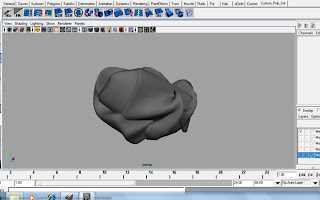
I was going for a more out worldly design for the next meteor design to hint out that something is not right about this rock.
Meteor 4

The last meteor design was meant to have an appearance that resembles a crunched up paper ball again another way of emphasise of how low our budget is on our film.
Meteor 5

Please leave some feedback on the Meteor designs if I need to improve them.

The first meteor is meant to be an oblong rock but more pointy on one end to give it a missile like appearance.
Meteor 1

The next meteor has the same idea but it has a hole in it to give the meteor a more interesting appearance as shown in the next image blow
Meteor 2
3/4

Front

The next meteor was purposely done poorly to gave more of lazy or lack of budget appearance
Meteor 3

I was going for a more out worldly design for the next meteor design to hint out that something is not right about this rock.
Meteor 4

The last meteor design was meant to have an appearance that resembles a crunched up paper ball again another way of emphasise of how low our budget is on our film.
Meteor 5

Please leave some feedback on the Meteor designs if I need to improve them.
Subscribe to:
Comments (Atom)


