I spent an evening finishing the scientists face. I also took the plunge in UV mapping before getting the mesh checked by anyone else. Although mapping didn't take that long and I'm fine with doing it again if there is something seriously wrong with the edge flow. Having said that, it should be exactly the same edge flow as in the tutorial guy. The only difference is really in the amount of extra rings going right around the head under the ear from the nose. They were needed because his face is twice as long! The only other difference is that the chin has an extra extrusion. I felt that it made his chin more defined and blocky. This is all part of the style of the character.
And take away the hair...
So as we've all found out that the ear usually ends up with less texture space unless you separate it. Well you may see that it is slightly more even with the rest of the face, but it still connected.
Well that's because the hair is covering up this awful stretching at the back. Unless he's going to have hair made of glass, no one will ever notice! (although I did save a copy of it before I made adjustments to the ear, where the back of the head was more even. Just to be on the safe side.)
Well I need to get on with modeling the rest of him as well as the soldier.
A Flock of Pixels.
Saturday, 20 November 2010
Thursday, 18 November 2010
Sketches: General Turnarounds Edit
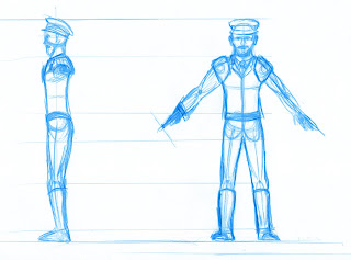
Today I have edited the The turnaround for the general, because when I was given the turnaround (first image) it was very messy so I cleaned it up on GIMP and it looks decent enough to use for a modeling template.
Look at the differnces between the first image and the second image and leave a feedback if it does look useable.
Administration: Mission Skype Meeting Accomplished!
Indeed, yesterday, we did our first meeting online via Skype and it was a success. We tried most of the features that we will be using to communicate over the Christmas period, such as conference calls and screen sharing. The most important thing and the whole point of this meeting was to try the microphones, and I can say we can hear each other loud and clear.
The whole downside was that we can't screen share with 3 or 4 people at the same time, unless we get the BETA version of Business Skype, which has a trial period of 28 Days.
So to sum up, we will be using Skype to communicate with each other as well as the blog, and over the Christmas Period we will try the BETA Version of Business Skype, to efficiently share our work with the other group members.
Monday, 15 November 2010
Support Sketches: Character Orthographic- Generic Characters
In order, to go according to the new plan, we were asked to produce the rest of the turnarounds for the generic characters. Here they are the turnarounds with a close-up of the face design to create the model of the head.
To complete these characters, clothes were added, in these designs, a research of 1950s clothes was needed and can be seen here. Where I used old designs, added with a twist of retro-futurism.
Generic Female Turnaround
Generic Male Turnaround
Also i though it was needed to tweak slightly the Scientist's Assistant face, so I can start modeling the head.
What is needed now is only to get these designs modeled something that I will start tomorrow.
Sketches: General Turnaround
So here's the situation. We need to get these characters modelled, and we have now divided up the modeling tasks. All we need are the turnarounds, so to further speed things along I have done a turnaround for the general. Based on Chris's sketches. So now Shahbir can start to model the general.
Oh, by the way Shahbir, if you feel you need to print this out and re trace the lines a bit more clearly, then by all means, do so. As it is still only a rough sketch. Just remember to blog it. And if your not sure of anything, we will all be in tomorrow anyway, so we can talk then.
That's it for now.
A Flock of Pixels
Oh and one last thing. I changed the top part of the body so that you can see a tie. If you wish to alter that, or make it more like the last drawing of the general (by Chris) then thats fine. I only changed it because I wanted to see a tie for some reason!
Administration:The plan
We have yet to design the generic characters, so to move things along I just posted some images of 50s fashion. The idea is that Ruben is going to design the generic characters, with these as (hopefully) useful reference. Then Ruben will be modeling the scientist assistant and female generic character, while Shahbir models the general and male generic character. Then it will be up to me to model the scientist and soldier and finish off the spaceman, (but that's almost done now anyway.)
Sunday, 14 November 2010
Maya: Spaceman Progress
I've made some progress with the spaceman. I altered a bit of geometry in the legs and added more pieces to the suit.
Here are some of the details.
I thought I'd better show this image just to prove he is invisible!
Now although he is meant to be missing his head, his hands, or gloves in this case are meant to be there. What I have done at the moment is taken the hand modeled in the Maya tutorials, and given it an extra finger. For a total of four. There are however two main problems. One of which is that it looks like a hand still, and not a glove. Easily fixed. The other, more important issue is the way the geometry flows. The spaceman's arm has eight edges. So the hand has to connect to the arm with eight edges. The problem with the hand is that initially had about double that coming out of the hand. So for the moment I got the edges flowing back on themselves. Although I'm not sure that it looks that tidy. Especially on the reverse side of the hand. The thumb squashes everything to one side. There's even a triangle too. I think I may need a bit of advice or help on this when I get back to uni.
Nothing is UV mapped yet. Although what I think I will do is map the rest of the suit while a wait to fix the hand.
_______________________________
We have seven characters in total, so I just felt I had to start modeling another character or at least the head. This is the scientist. Done by Ruben.
I drew a much larger version of the head so I had more to go by, its much the same really.
I have started blocking out the scientists face. It's very basic at the moment and has a lot of stretched faces, due to the shape of the head. I think I'm going to have to add extra geometry, possibly re direct it to better suit the shape of the head. It looks quite scary to be honest!
That's all for now.
A Flock of Pixels.
Concept: Retro-Futuristic London, Hyde Park
Here is another concept for the Narrative project, depicting the great retro-futuristic metropolis, in this place specifically one of many pods will crash-land and wreak havoc in such a peaceful and technological advanced place.
For this concept I used one photograph taken by me, in one of the many trips to the English Capital, to adjust it to fit I had to crop it and change some fore and background elements. Overall I think I succeed in conveying the huge area where the pod will land and the Invisible cannibals will come out.
Here is the final concept:
Also the WIPS for the same concept, where you can seethe progress done and what more or less I had to change from the original picture.
Alongside this concept, I am also posting the original picture, so it can be seen the difference between both.
Subscribe to:
Posts (Atom)