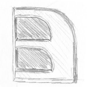
So from my sketch book came some initial designs. My first idea was actually how it could be animated. Each letter would just slide out from behind the previous letter. So starting with B, the 3 effectively duplicates from the B, sliding right, then somehow the D replicates from the 3. Never quite figured out how, other than morphing it.
So I started by just drawing the letters, making sure the 3 was drawn so the end bits didn't curl round. As I attempted to draw my idea, all the letters got meshed together.
Looking at the sketches you can see how it evolved, we also experimented with a few different shapes and then we all decided on this design.
I can see the 3. I can see a reversed £ sign and or a reversed E. So basically I don't think it is the final design. Although what does the rest of the studio think? Or anyone else.
PS. I'm not supposed to tell anyone this but our latest film is entitled, The Day of the Invisible Cannibals from Beyond the Stars. We will be releasing a trailer for it in 15 weeks time. But you didn't hear any of this from A Flock of Pixels.
Oh well... the secrets out. So you'll probably see a lot more posts on it during the run up to the trailer.


No comments:
Post a Comment