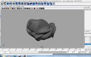
The first meteor is meant to be an oblong rock but more pointy on one end to give it a missile like appearance.
Meteor 1

The next meteor has the same idea but it has a hole in it to give the meteor a more interesting appearance as shown in the next image blow
Meteor 2
3/4

Front

The next meteor was purposely done poorly to gave more of lazy or lack of budget appearance
Meteor 3

I was going for a more out worldly design for the next meteor design to hint out that something is not right about this rock.
Meteor 4

The last meteor design was meant to have an appearance that resembles a crunched up paper ball again another way of emphasise of how low our budget is on our film.
Meteor 5

Please leave some feedback on the Meteor designs if I need to improve them.

I like them all - but the question should be 'what could your production company afford to produce on its tiny budget'? Is your meteor going to look suitably 'cheesy'?
ReplyDeleteSee below for so-bad-they're-good meteors...
http://www.youtube.com/watch?v=ErFsW4-FDWw
http://www.youtube.com/watch?v=hR7e3StbXoU
Hi Shahbir!
ReplyDeleteI will sum up all the feedback for all the previous posts on here.
@Cars:
I do think they are getting in shape but maybe you will have to add some bevels on the on the edges to support better the geometry.
@Tank:
I love it! the development from the bubbly look to a more stronger look, is the way forward.
@ Inside of the tank:
Just add some more controls on the inside, at the moment is seeming to empty.
@ Army Desk
The only thing is maybe just close the set despite not much action will take place there, we will still see the room, when the camera follows the General's hand.
@the meteors
To echo Phil, I like the meteors, specially the last one, however, as I showed you the same trailers that were in Phhil's comment, try to produce some that can be destructed, just like " IT Came from Outer Space" Trailer.
Anyway, I let Ethan give you the final Feedback as he is in charge of modelling.
Keep up!
Just thought I'd throw in my opinion.
ReplyDeleteThe tank is much better with the hard edges. I still think the middle section should be wider, but other than that. Perfect!
Now the meteors. You have some interesting and fancy shapes. I like them, but I agree that they may be too fancy. I don't know whether this is a good thing or a bad thing, but the last meteor looks like a screwed up piece of paper!
I'll look at everything else in greater detail tomorrow.