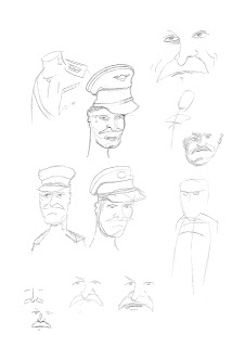
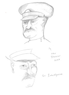
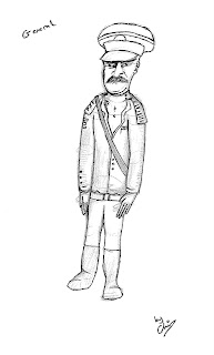
To gain this design I took the old sketches I created when trying to understand the Generals appearance and character, then kept on refining them using different source images available online. Using the trusty eye of my team mates I was encouraged to pay close attention to the detail used on the character to ensure he delivers his intentional presence correctly. This will also help with the turn arounds, which makes life far more easier when modelling. The General is also bears some comparison to the newly refined solder design.


Using a website entitled "posemaniacs.com" I took several different poses from a selection of digital models and merged them together in photoshop to create the right pose for my General. I tweaked the pose using a lightbox when I wasnt satisfied with it to produce the final skeleton for my General design.
Chris


It's good to see you're using external reference on anatomey. Just a few pointers...
ReplyDeleteThe reference shows the guy on tip toes. Which has carried thorugh to your sketch. I wonder whether bringing the legs in and flatttening the feet would improve the pose in general. That way it would look more like a standing pose.
The other important thing to note is the center line. In the diagram the central line is to the left side of the body. (This is because the pose is at an angle, not front on)
If you were to do the same in your sketch, along with increasing the size of the circle on the right side of the chest and decrease on the left, should bring him into 3D more.
I hope this advice is helpfull.
Ps. The close ups of the faces are looking a lot less cartoony and much better because of it!
You just need to practice the perspective. So I suppose to keep drawing is all that's left to say really. :)
Sorry. I can see that you've reliesed the whole tip toe thing already and tweaked the final image acordingly.
ReplyDeleteI very quickly scrolled down and looked at the last couple of images! woops...