

Saturday, 6 November 2010
Maya: Army Office Desk
Here is another scene I made which is the Army General office where he is talking to the prime minister. I gave it a typical desk with filing cabinet but i decided not to add detail to the cabinet because this scene is mostly seen on the top of the desk.

Maya: Tank Outside and Inside
I almost finished making the tank for our film, just need to talk to Alan about the script he gave me because when ever I use it some o the models that are duplicated move in a glitchy manner.
The first three images shows the progress of the tank build, from it's soft appearance to the tanks final form.
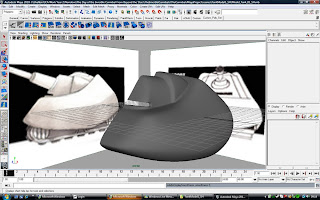
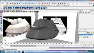
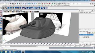
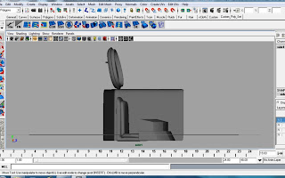
I have also made the inside of the tank, I didn't do too much detail because this is meant to be a set of a film studio as well as a replication of the budgetness of our film also since this is the future the military might have some sort of fancy key board to shoot their weapons.
3/4

Side
Leave feedback on the designs of the tank outside and inside
The first three images shows the progress of the tank build, from it's soft appearance to the tanks final form.


I have also made the inside of the tank, I didn't do too much detail because this is meant to be a set of a film studio as well as a replication of the budgetness of our film also since this is the future the military might have some sort of fancy key board to shoot their weapons.
3/4

Side

Leave feedback on the designs of the tank outside and inside
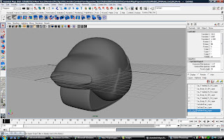
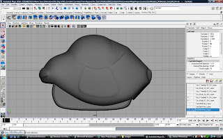
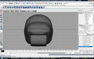
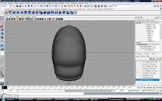
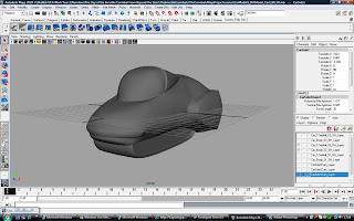
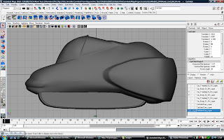
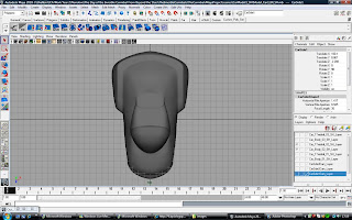
Maya: Car Models 1, 2, & 3
Here are all the images of the three cars I was working on last week, they all have 4 different views so you can see them at different angles. Sorry it took long but my internet at the house I was living in had trouble uploading, lucky I was able to do it at my home in Hampton.
The three cars a meant to carry a retro future feel which is what our film is focusing around, all the cars are different but all have one thing in common which is they all have one big treadmill. The first model I made was cheap retro future car which I believe met to be small and not too flashy but able to drive.
Car 1
3/4
Side
Front
Top
The second I made is an expensive car it should have a sleek appearance and which I believe should be a sports car that can carry at least two people.
Car 2
3/4
Side
Front

Top
The last car I made is in between cheap and expensive, it has the sleek appearacne but a bit wide which I think is ment to put ta family in the car.
Car3

Side
Front


The three cars a meant to carry a retro future feel which is what our film is focusing around, all the cars are different but all have one thing in common which is they all have one big treadmill. The first model I made was cheap retro future car which I believe met to be small and not too flashy but able to drive.
Car 1
3/4

Side

Front

Top

The second I made is an expensive car it should have a sleek appearance and which I believe should be a sports car that can carry at least two people.
Car 2
3/4

Side

Front

Top

The last car I made is in between cheap and expensive, it has the sleek appearacne but a bit wide which I think is ment to put ta family in the car.
Car3
3/4

Side

Front

Top

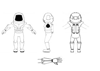
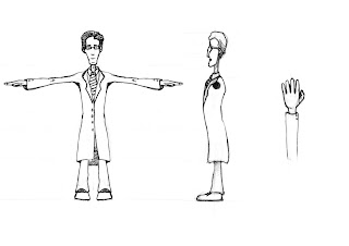
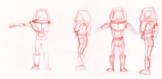
Support Sketches: Character Orthographic Views Development
A few days ago Ruben emailed me three of the character orthographs, the spaceman, the scientist and the scientists assistant.
The Spaceman
The Scientist
The Scientists Assistant
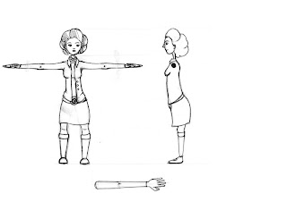
They looked more or less fine, however I felt that there were just a few small adjustments to make before modeling them. The only reason for me being picky is that I know that the 3D models won't be that different from the orthographs, which means that if there is any mistake, it will still be there in 3D.
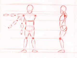
The main concern was in the side view of the spaceman. The top half of his body armour was looking too thin. I too was having trouble with the side view when I was doing the first designs several weeks back, but I kind of wanted the proportions of Buzz Lightyear.

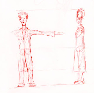
Basically the helmet in our spaceman is supposed to be stuck all around the neck of the suit and not squished inwards, to where the neck of the guy in the suit is. Anyway we all agreed that the side view needed to be adjusted, so I had another go at sketching the side view.
I started with just a generic figure.
Then drawing the space suit over the top. It still wasn't looking quite right.
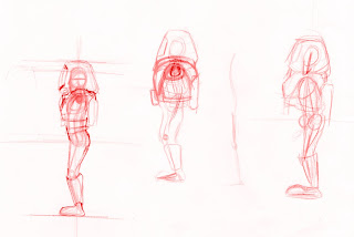
I had a few more attempts...
...and I think I got roughly what I was looking for in the last drawing (far right).
Although the angle of the picture is slightly off, I think this is the best so far. I made a few other adjustments. His legs are straighter and he is leaning forward slightly to counter balance the canisters on his back. I just need to draw it a bit neater now.
While I was in a drawing sort of mood I went ahead and had a go at drawing the scientist. There isn't really anything wrong with the original. The only difference when I drew it was that I drew on the skeleton. The only way that helps is that I know exactly where the legs joint to the body, but I'll probably just stick with the original anyway.
Now the assistant. Again, there wasn't much to adjust, but I thought that the legs were going too straight up. Something about the pose looked kind of awkward. I could be wrong, but maybe second opinion? So I angled them going inwards a bit. Also in the side view, I straightened the back a bit as well.
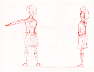
I'm still not quite sure about the assistant. If anyone else (not just studio members) can give some feedback on the drawings, it would be much appreciated.
A Flock of Pixels.
The Spaceman

The Scientist

The Scientists Assistant

They looked more or less fine, however I felt that there were just a few small adjustments to make before modeling them. The only reason for me being picky is that I know that the 3D models won't be that different from the orthographs, which means that if there is any mistake, it will still be there in 3D.
The main concern was in the side view of the spaceman. The top half of his body armour was looking too thin. I too was having trouble with the side view when I was doing the first designs several weeks back, but I kind of wanted the proportions of Buzz Lightyear.
Basically the helmet in our spaceman is supposed to be stuck all around the neck of the suit and not squished inwards, to where the neck of the guy in the suit is. Anyway we all agreed that the side view needed to be adjusted, so I had another go at sketching the side view.
I started with just a generic figure.

Then drawing the space suit over the top. It still wasn't looking quite right.

I had a few more attempts...

...and I think I got roughly what I was looking for in the last drawing (far right).
Although the angle of the picture is slightly off, I think this is the best so far. I made a few other adjustments. His legs are straighter and he is leaning forward slightly to counter balance the canisters on his back. I just need to draw it a bit neater now.
While I was in a drawing sort of mood I went ahead and had a go at drawing the scientist. There isn't really anything wrong with the original. The only difference when I drew it was that I drew on the skeleton. The only way that helps is that I know exactly where the legs joint to the body, but I'll probably just stick with the original anyway.

Now the assistant. Again, there wasn't much to adjust, but I thought that the legs were going too straight up. Something about the pose looked kind of awkward. I could be wrong, but maybe second opinion? So I angled them going inwards a bit. Also in the side view, I straightened the back a bit as well.

I'm still not quite sure about the assistant. If anyone else (not just studio members) can give some feedback on the drawings, it would be much appreciated.
A Flock of Pixels.
Friday, 5 November 2010
Sketches: The General - Designs and Final Sketch
Here is the final design for the General in "The Day of the Invisible Cannibals from Beyond the Stars". It is a mixture of difficulties that I came to confront when designing him, which although took longer than neccesary has hopefully provided the film with memorable characters. This General is a mixture of classic general designs, gaining influence from historical resources entwined with the imaginitive spark of the science fiction films past and present. To keep modelling simple, and due to the simplistic nature of appearances in the 1950's I tried not to over do the Generals design. Here he is!


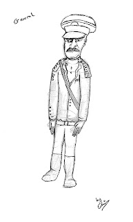
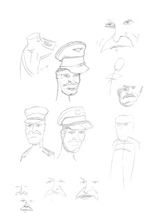
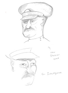


To gain this design I took the old sketches I created when trying to understand the Generals appearance and character, then kept on refining them using different source images available online. Using the trusty eye of my team mates I was encouraged to pay close attention to the detail used on the character to ensure he delivers his intentional presence correctly. This will also help with the turn arounds, which makes life far more easier when modelling. The General is also bears some comparison to the newly refined solder design.


Using a website entitled "posemaniacs.com" I took several different poses from a selection of digital models and merged them together in photoshop to create the right pose for my General. I tweaked the pose using a lightbox when I wasnt satisfied with it to produce the final skeleton for my General design.


Chris
Thursday, 4 November 2010
Research: Texturing- Painting Techniques for Maquettes
Having already some models pretty much done, I felt the urge to research some techniques used in cinema, to paint maquettes. This research will be important to understand and therefore apply this same techniques to the respective small scale models.
Firstly, what is a Maquette? - It is a small scale model done and used by artists to visualize the final piece, in early cinema it was also used to depict places imaginary to the directors, and used to the final film just before CG was available.
An example of maquette used in film, can be seen in the 1990 Tim Burton's Edward Scissorhands, this gave the chance to create dynamic shots at low costs. However, not using much of a maquette for environment, unless to do the futuristc model metropolis, same techniques were used to create props which later would be used in films.
-Airbushing
-Spray
-Brushes
These 2 videos show some techniques being used in to paint models, either using a tiny brush to detail the model.
Understanding these techniques we will be able use similar and paint textures on the miniature models, also tweak it to offer it a more hand-made look.
Firstly, what is a Maquette? - It is a small scale model done and used by artists to visualize the final piece, in early cinema it was also used to depict places imaginary to the directors, and used to the final film just before CG was available.
An example of maquette used in film, can be seen in the 1990 Tim Burton's Edward Scissorhands, this gave the chance to create dynamic shots at low costs. However, not using much of a maquette for environment, unless to do the futuristc model metropolis, same techniques were used to create props which later would be used in films.
Stepping onto the tecnhiques used to paint this same maquettes, many are used: -Airbushing
-Spray
-Brushes
These 2 videos show some techniques being used in to paint models, either using a tiny brush to detail the model.
Understanding these techniques we will be able use similar and paint textures on the miniature models, also tweak it to offer it a more hand-made look.
Wednesday, 3 November 2010
Concept: Space Station Interior
Here is the latest concept art piece, I have been working on it depicts the inside of the Space station which will be attacked by those fake meteors. This concept not only depicts the place but also try to show it as a a set, so to set things straight, this interior is not more than only a cheap set designed as a space station interior. The rounded shape corridor is to share logic with the rounded shape of the Space Station exterior.

Alongside the final piece, here is also a step-by-step, of what I did from perspective grid to adding final details.


Alongside the final piece, here is also a step-by-step, of what I did from perspective grid to adding final details.

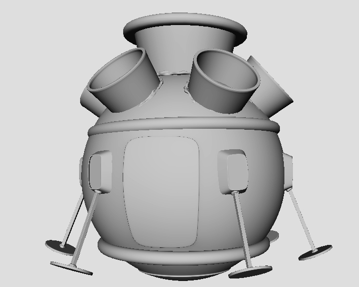
Modeling: Space Station Miniature - Basic Model
I've started and I suppose almost finished the space station miniature model.
I've provided both a wire frame and non wire frame screen shot of the space station, in both smoothed and unsmoothed preview mode.


Just a side note. The middle ring is very chunky and isn't a perfect ring. (it raises up at the side parts.) I had this idea that it would be made out of some sort of modeling clay or plasticine. Then in the bump map we could give it giant finger prints. That will certainly make it look small!

And just for good measure, here's the underside view.


OK. Things that need doing are the UV mapping. I haven't even started that yet. It does mean that I will have to delete some of the repeated shapes, UV map them and re duplicate them, but that's fine. The only other thing missing from this compared to the space pod are the bits of glue. I have a rough Idea of where I'm going to place it. I also need to make sure some of the parts are stuck on irregularly, to get red of the uniformity.
So how is the space pod coming along?
Well. I've added a bit more glue around some other parts of the objects. Unfortunately I am going to have to accept that there are more polygons used in the glue geometry, than there are in the rest of the model. Even if it is from a reasonable distance on camera, the obvious lumps of glue really add to the overall look and is something that a really decent texture alone could not do.
I'm tempted to make the glue even more visible by making it more chunky. I suppose I've got to not over do it though, and get the balance just right.


I've also done a bit of re sizing the UVs, but I still haven't figured out how to fit them into a square. I'm not even sure if I should put the textures over several map arrangements. The thing is that I'm not sure whats the best way to go about it. I especially don't want to be wasting space on a half used square. I'd really like some help on this at some point. Maybe tomorrow as it's all day Maya.

Here is a link to the pod in the previous post.
I've provided both a wire frame and non wire frame screen shot of the space station, in both smoothed and unsmoothed preview mode.


And just for good measure, here's the underside view.


OK. Things that need doing are the UV mapping. I haven't even started that yet. It does mean that I will have to delete some of the repeated shapes, UV map them and re duplicate them, but that's fine. The only other thing missing from this compared to the space pod are the bits of glue. I have a rough Idea of where I'm going to place it. I also need to make sure some of the parts are stuck on irregularly, to get red of the uniformity.
So how is the space pod coming along?
Well. I've added a bit more glue around some other parts of the objects. Unfortunately I am going to have to accept that there are more polygons used in the glue geometry, than there are in the rest of the model. Even if it is from a reasonable distance on camera, the obvious lumps of glue really add to the overall look and is something that a really decent texture alone could not do.
I'm tempted to make the glue even more visible by making it more chunky. I suppose I've got to not over do it though, and get the balance just right.


I've also done a bit of re sizing the UVs, but I still haven't figured out how to fit them into a square. I'm not even sure if I should put the textures over several map arrangements. The thing is that I'm not sure whats the best way to go about it. I especially don't want to be wasting space on a half used square. I'd really like some help on this at some point. Maybe tomorrow as it's all day Maya.

Here is a link to the pod in the previous post.
Subscribe to:
Posts (Atom)