Saturday 23 October 2010

Documentary: British B-Movies: Truly, Madly, Cheaply, 2008, BBC


Today, as a group and to keep the morale up, we watched a documentary related to the British B-movie period.
Called British B-Movies: Truly, Madly, Cheaply is a documentary produced by BBC and presented by Matthew Sweet, in which he explores the cheesiest era of second-class British films.
The documentary explains why b-movies were created, in which genres they appeared and the main difference, between British and its brother American B-Movie. It was interesting to know that b-movies had a wide-range of genres, from comedy to sci-fi, from horror to exploitation. these films in such different genres contributted create one of the most iconic era in British Cinema.
Already knowing that B-movie stands for a low-budget film, it was surprising to know the different techniques that Directors of that time used to create this cheap and cheesy films, from bad camera position, to fixed camera positions where people would hover around the set, and from repetition of the same sets in different films to the use of the same footage over and over again.
We already know that, b-movies are often characterized by its bad-acting, and that is what this documentary explores some of the worst over dramatic actings in these films that would entertain audiences around Britain.
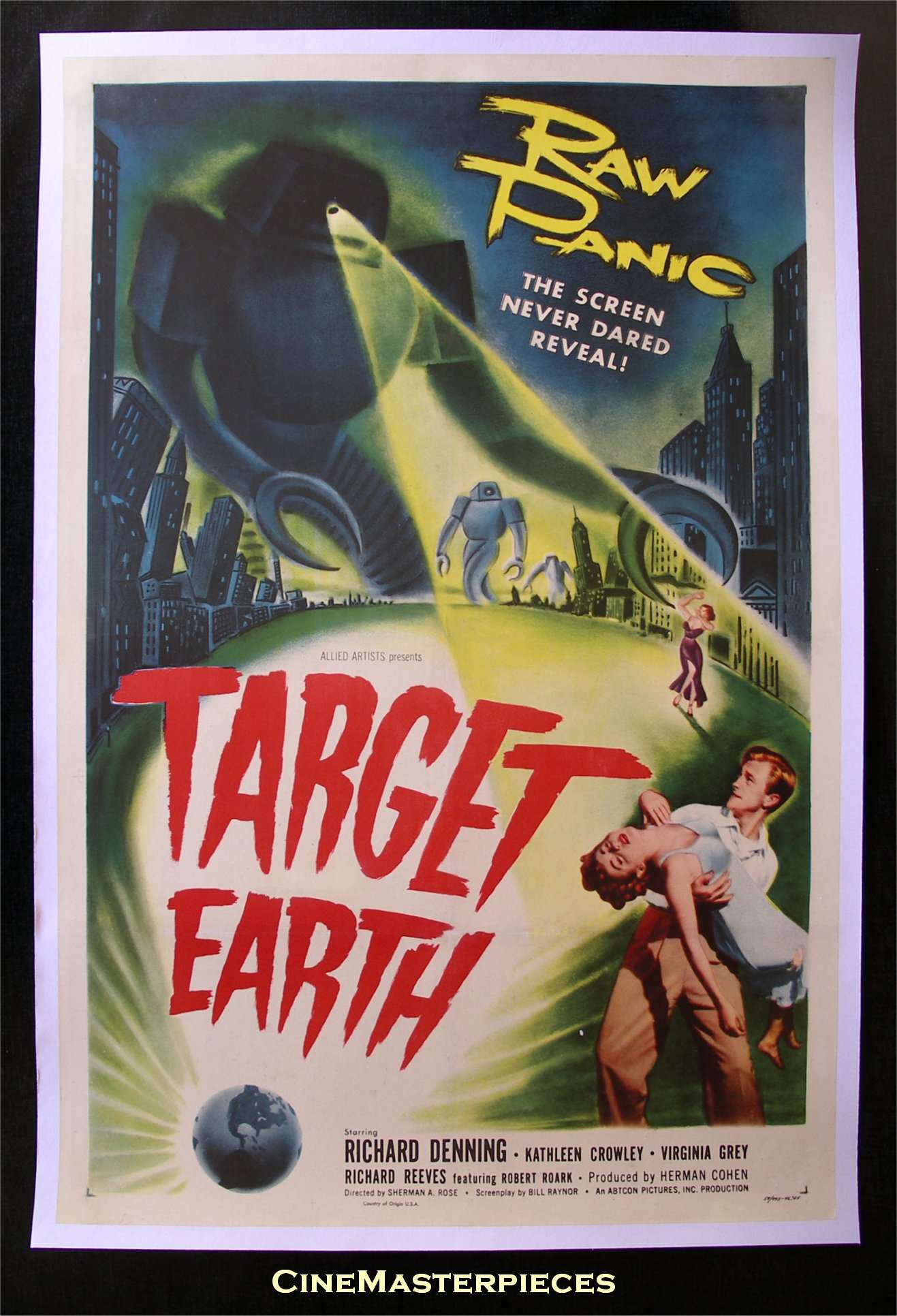
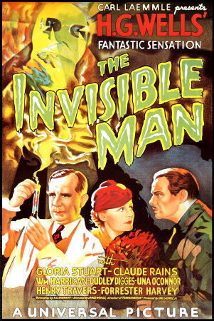
As mentioned before, the documentary distinguished a British B-Movie and a American B-movie, Apart from the different accent many other things made these 2 types of cinemas distinct. For instance, where in an American B-movie we would have a monster or alien would explicitely invade a city, kidnap the most gorgeous woman and be a threat for all human kind, brtish B-movies are more modest, by often associate alien invasion with the act of possessing a human body, ( seen in films such as Quartermass Experiment and Trollenberg Terror) which would create a more sneaky approach by the alien yet conveying horrific moments. Also the American bombshell woman/victim, is substituted in the British films, by someone more sophisticated and mature, often a spouse or a housewife. The modesty and use of this type of character, by no means stopped conveying any less glamour, however it create other type of charm.


As a documentary, I was incredible satisfied to show it to my group, because not only now we can associate our animation with the british type of b-movie, as we show possessing of a human body by an alien force and reveal the monster slowly and by the end of the trailer, and but we can also move forward with a clearer idea of this type of cinema.

*EDIT*

Oops.. I think the text was repeated, not really know what happened, but I was finding strange that i wrote lot for a review :)

Administration- Timetable for Week 6

Here is the timetable for week 6, for better work and to be on the top of things, i will address a time management issue with a weekly timetable, so instead of a 5 weeks one, we will have a weekly, upon which we can change if needed. Also, me and the new administrator Ethan, will be scheduling the maya tasks individually, so we will have an accurate timetable of modeling , texturing, rigging, etc, needs to be done.

So far here for next week, where we finish the Pre-Production stage and start the Production.


Week
6
Last week of Pre-Production and beginning of Production


Monday  
Discuss Characters, choose final concepts
Discuss Production Roles

Chris-Design all of the chosen Characters on Monday.
Ethan-Finish any Pre-viz scenes, and start modeling the Props. (Spacestation
Exterior)
Shahbir-Finish Business Cards,Forum Banner and Publish our studio on the
forum.
Ruben- Finish Spaceman Concept and help on the Character Design.


Tuesday
Chris-Painting Character Concepts
Ethan- Prop modeling (Finish Space Station Exterior Start Pod)
Shahbir-Poster Designs ( teaser poster example and a final poster example). Update
forum thread.
Ruben- Environmental Design


Wednesday
Ethan Away!
Shahbir- Prop Modeling (Cars)
Chris- Paint Character Concepts
Ruben-Environmental Design


Thursday
Ethan-Character Modeling
Shahbir-Prop Modeling (RAD device)
Chris-Finish Character Paintings
Ruben- Environmental Design


Friday
Shahbir Away!!
Ruben Away!!
Ethan- Character Modeling
Chris- Refine Poster Designs


Friday 22 October 2010

Research: Character Design Influence Maps by Ruben

As the new assigned Art director alongside my colleague Chris, I decided to take the characters already designed for our project, and bring them together to the Art style we are going for. In the pitch, the feedback related to the characters was that they despite being good designs, they were belonging to a completely different world, a more cartoony and stylised world.
So in order to move this project forward quicker, me and Chris and the rest of the group are working together to create characters that will fit with our animation style.
The first step is to come up with some influence maps that can be used not only by me, but also by any other group member, to base their sketches on it. For the purpose, to bring the style of the characters create closer to the same style.
Although this job was done a few weeks, ago, due to the circumstances it is needed to redo all the influence maps and forget the old ones as they belong to a different world.


 The Scientist- Influence Map


Working closely with the director, me as the Art director, am trying to portray his idea of the scientist to perfectly fit in our animation. After his description of scientist, I restarted the researching british scientist looks. the description he gave me of a scientist can easily be associated with the term "boffins", which consist in scientists, medical doctors, engineers and other people based in the scientific research area. This term is often associated to a certain type of character, a clever and nerdy person, become a quite introverted person. Litterally, what we are looking for.


General- Influence Map

Another issue, was our general character, where we went for a more American approach of Army, in order to Anglicize the general we have to bear in mind the idea that British Army is completely different from the American. British Army is often known as a more sophisticated body of attack and defense. Therefore, our "destructive" look General was a bit misplaced. To understand this sophistication, I gather some different pictures from real-life generals and some actors playing General in British films and TV Series. Clearly the difference is visible between concepts.


Scientist's Assistant- Influence Map


Our Scientist's Assistant and the main woman in our animation, was again misinterpreted, the idea of a bombshell character was something we aimed for but in the end it would not fit in the animation. To create a truthful British assistant, we have to understand how they often appeared either in TV Series or Films. On one hand, American main actresses were filled with glamour and sex-appeal, British Actresses were more modest, using this modest beauty in their favour. The modest type of women starred in these films, brought cuteness to the film, but also they were associated to British culture of that time.


Names such as Barbara Wright, Janet Munro, Liz Shaw, Sara Kingdom, Victoria Waterfield and Susan Foreman, among many others, are names worth looking for.


Generic Woman- Influence Map

Finally, another character misinterpreted, was a generic female character, although not as important as the main characters, it is a extra character which will be need in our animation world. So a faithful understanding of women in 1950's Britain is crucial, looking at their look, we have an idea how a extra actor would look when featured in a 1950 film.


Hopefully, this post will be useful for all our members who will be designing their own ideas of the character over the weekend, and first thing monday a meeting to choose the definite type of character.


Research: London Landmarks

To create a rather more familiar look for our animation to British audience, we decided to incorporate some lhistorical landmarks that will characterized the metropolis upon we are setting our city. Many landmarks could make the list, however, and in order to follow through the idea that we are setting our animation in the year 2000 but with the vision of 1950's, just some can fit in it.
The use these landmarks and in order to not only saves us time modelling the landmarks, but also to use the same technique of composition tow footages in one, ( even if one is a backdrop and other is the CG Render).

To show our imaginary world in the animtion we have a small sequence at the beggining of the trailer when we show establishing shots of the world. Landmarks such as, Big Ben , Tower Bridge, St Pauls Cathedral or Hyde Park, have a posssibility to feature in our scene.


Big Ben


Big Ben is a must have landmark in the animation, not only for many centuries has been the main attraction for travellers and Britons alike, but also it marked the beginning of the Industrial Revolution, something to constrast with our retro-futuristic style.


Hyde Park 

Our pod will land in some sort of green park, so what about make it land in such a distinguish green park for many British people, Hyde Park, a green park in the center of London, with beautiful patches of green grass, i do think the perfect setting for a menace from outer space. Although Hyde Park is in the center of London, we are not particularly happy of using the existing buildings surrounding it, so our cheap architect in service have to plan some more retro-futuristic buildings to populate the surroundings of the park.


Don't you agree such a beautiful place, with atmospheric lighting shining through. Perfect for a dramatic landing site.


St Paul's Cathedral


St. Paul's cathedral is another landmark building that maybe we will be featuring in our animation, this idea came from a post posted before by Aflockopfpixels, which shows a picture from the Invasion of the Cybermen Episode in one of the first Doctor Who: Episodes. In order, to pay a homage to the so famous series, and to identify clearly with the British audience, we are thinking of using the same type of setting when the Invisible Cannibals attack the human race. 


In order to create a successful backdrop, the concept artist in the group will take on pictures and create a matte painting, which will a cheaper version of actually go on site and record real life-footage.

If you wonder, the coloured images were taken by Ruben, in one of many trips to London, good to see that after sometime they start to be useful. 


Marketing: New B3D Logo, Fully Three Dimensional

A Flock of Pixels here!

Today I decided on having a break from sketching and decided to turn our logo from a simple Photoshop image into a fully three dimensional logo. After all, we are B3D!

So I went into Maya and modelled the logo. I then done a simple animation, lit it, shaded it, and rendered it. Although I rendered some of the elements separately so I could further mess around in After Effects.

I have here two versions to show. Both don't have sound.

The first is the final render, which I composited together into it's simplest form.


With the second version, I have made a few slight adjustments.


Such as a curves adjustment as I thought that it needed to be slightly brighter. I also added and animated the glow effect. Not sure whether this is needed, but I put it in anyway. The last difference is that the logo separates from the background at the end.

That's it. I could have done all kinds of combinations. (With or without glow. With or without the logo separation. Whether it should it be brighter or not. etc)

Please comment on what you like and dislike about these test idents. Whether it be a slight change in camera angle or a colour change.

One thing I did notice about the angle of the logo is that the left side of it is not visible. So the only time it really looks 3D is before the 3 covers up the inner right side of the logo. I kind of like that though, especially in the second example, where the logo separates at the end. It looks 2D again. Of course if you think it should be 3D all the way then comment by all means. I just know that a lot of 3D logos have a 2D version as well.

I'll end by saying that Ruben and I also discussed about what kind of character to include with the logo and also how it could animate.
We were thinking of a simple little robot on wheels. In the ident, we thought that maybe the 3 could get stuck half way between the B and D. Then the robot could come along and push it the rest of the way. Although we're not quite sure where the robot would go next. Whether it be off screen or stay next to the logo somewhere.

Again your thoughts on this will be appreciated.

Research: Character Design Influence- Dan Dare

Dan Dare is a British comic hero, drawn up by the wild illustrations of Frank Hampson. Dans claim to fame was through the stories of Dan Dare, Pilot of the future, published by Eagle Comics. His name was spread further on a highly anticipated radio show every week.


The storylines are set in the 90s but the ways in which the characters behave are similar to the manner of British War films during the 1950's. The character is typically set amoungst a colourful, bold comic world, which boasts the 50's visually and keeps well to its time.

There is a new Dan Dare available that has recently been published, which is available from Forbiden Planet.  Recently a mini-series of Dan Dare has been launched by Virgin Comics. Written by Garth Ennis and Illustrated by Gary Erskine and is a completely new and somewhat darker intrepretation of Dan Dare. There is also CG interpritations of the adventures of Dan Dare and his travels, somewhat impressivly keeping to his stylistic theme. Good art direction there! Something I need for our group...

Chris

Research: British B-Movies Trailers

In terms, to Anglicize our film, We researched more specifically the B-movies made on this side of the Atlantic. Although American B-movies were a big part of hollywood cinema, British b-movies contributed not only for British cinema, but also to worldwide cinema.

Investigating the importance of British B-movies, we looked at some trailers for the same films.

Devil Girl From Mars


Devil Girl from Mars is a British B-movie, best know for most of cheesiest moments, the cheap special effects, bad lighting and some bad acting, in cinema, however it populated with good things, being a low-budget film, it gave the chance to audience to go and see it more often at a cheaper price. Although the special effects can be define as being bad for today's cinema, for that time, they created one of the most chilling moments.
These factors can be seen already in the trailer, which consists of voicovers, which will basically tell you the whole film. The abundance of sci-fi sound -effects, and the look of cheap of special effects.


The Earth Dies Screaming

 
The Earth Dies Screaming is another good example, of a cheap version of film, by mixing real life footage with studio footage and with disastrous acting, creates a really chilling yet welcoming film to watch. The idea of using composited footages, will be something to consider in our project. Despite being a CG Animtion, we are trying to recordr footge seperately and later composited into the same animation.


Cosmic Monsters


Cosmic Monsters, is another british B-movie, which explores the imagination of birtish cinema, while in America films were worried to show an alien menace, The very British Cosmic Monsters, brought human together to fight an alien race of another type in so familiar soil. This was something present in many British b-movies, the use of totally different menaces and monsters with the same alien invasion narrative.


The Trollenberg Terror


The Trollenberg Terror, also known as The Crawling Eye in America, is other of many sci-fi British B-movies, It deals once again with composition technique of two footages, one being a small replica of the monster, and other a real fotage acting, although it is visible for the so attentive eye today, it was a amzing use of special effects of that time.


The Quartermass Xperiment


X The Unknown


Another 2 trailers really known to British audience as the story was first featured in BBC TV Series with the same name. Again these 2 trailers, show all the characteristics pointed before cheesy voice-over, cheap acting and poorly written storyline.

Overall, these trailers will helps distinguish our own animation, not only because they are British, but because they bear British characteristic on the B-Movies.

Research:The Scientist - re design development - Influence Map


Here is the first influence map for the Scientists character, which we shall be refining to create a finalised character for our trailer. We are going to be re developing each of the characters as our feedback suggests they are too Americanised in contrast with our storyline. Each character shall be sketched out again in different forms relating to character research, therefore ensuring the designs fit into the world that our trailer is suited to. I will then digitally paint the characters again, this time however using a more 3D based stylisation.

Chris

Thursday 21 October 2010

Administration: Feedback Meeting

After yesterday problematic presentation, we decided to meet up today to discuss our group and discuss the progress of our project, however for an obvious reason this meeting didn't take place until late this day after the maya classes.

After observing our group yesterday, I felt the urge to address some issues related not only with working ethic but also with time management, as they associate closely with each other. So I came up with a list to support me and to all know the issues we addressed. Being Ethan, the director and me (Ruben), the producer/time manager, we gathered the group and face them with the problems.

Here is a list of what we discussed.


Management Roles:

-Address the Management Roles, and discuss changes.
-Time Keeping Issue and try to resolve it.
-Address problems in Pre-Production Roles
-Talk about communication,
-Member Feedback on Studio.
-Motivation and self-initiation.
-Blog Updates- and change of role.
-Address Time-Management.
-Show register and project plan and update group on what is the situation.


Project:

-Marketing:Talk about Designing Business Cards, Posters.
-Character Design: Address the current situation ( misinterpretation of the characters) and apply a more British feel.
-Concept Art: Insertion of landmarks to the set, so they will look more familiar.
-Animatic- All good and a big achievement for us, now give the same spirit and work to the final animation.
-Pre-Viz: To understand some of the Scenes, Until the end of the week and in order to rather relax in terms of drawing, Pre-Viz of the key scenes can be done. ( for Ethan).

After, speaking with the group about these issues, they all seemed excited to turn around our current position and move our project forward. So hopefully form this point onwards, things will be better.
To echo the previous comment by lovely Jackie, Onwards and Upwards!!

Administration- New Management Roles

After not so successful presentation at the pitch, it was clearly visible that our group was having some issues in terms of communication, management roles, etc. To not leave these factors damage our project, we decided to address them straight away.
So as the producer and administrator, I decided to change a bit the management roles, in order to our group to work more efficiently, something that has been lacking lately.

Animatic: Final Storyboard Animatic

Here is the final version of the storyboard animatic which was presented yesterday at the pitch, although some of the sci-fi sounds are not in there, such as the Theremin, it is pretty much paced and ready for our final animation.
These sounds will be added in the end, when we have a clear idea what will be the Theremin sound.

Wednesday 20 October 2010

Todays Pitch - but where next I wonder?

A Flock of Pixels here!

If your interested on my take of how the pitch went then read on. Otherwise, you can skip to where the line ends.

______________________________

I was a bit irritated by how the pitch went today. As a team we are experiencing some time keeping issues, which in turn accounts for some lack of communication or in today's case, preparation for the pitch.

What I found irritating was that there were things we missed saying about our intentions for the project, things that I would liked to have said at the pitch.

Although I'm sure Phil and Alan knew most of our intentions, such as using techniques like the use of footage being repeated or purposely using miniature models for space ships, and as I said near the beginning of the project, to think about how you would make something assuming we don't have cg or a professional modelling department. e.g. The RAD (Refraction Anomaly Detector) is just a hair dryer with bits stuck on. (It doesn't get a mention in the trailer if your wondering where this came from).

What I'm saying is that It would have been nice if we all could have been more prepared for this, that way we wouldn't have missed anything out or say something in the wrong order, I mean I made a very stupid mistake of not telling anyone the title of our film!

But the pitch is done now, and although it wasn't a good pitch, at least the animatic is working well. We did get some very useful feedback, but now is the time to move on.
So where we are going next?

______________________________


I never would have thought to use famous landmarks in our future world. As said today, our film is very British and it was suggested that we use landmarks in the trailer such as Big Ben. The moment that was said the first thing that sprang to mind are these well known images (amongst Doctor Who fans. One day… Just one day there will be a project where I don't need to mention Doctor Who!!!)

Here we have Daleks on Westminster Bridge, with Big Ben in the background.


And the Cybermen with St Paul's Cathedral in the background.


So it would be good if we could see a famous landmark or two in the trailer, such as Big Ben. Perhaps not to use close up, but in the background, Or have one of the pods fly past it.
Since it would be an unnecessary challenge to model Big Ben, we could use old photos and composite them into the background. (I obviously know not to use landmarks such as the London Eye! Although built in 1999, no one knew that in the 50s! Could make a joke out of it though...)

The other thing mentioned was that some of the character designs don't fit together with the rest of the project. Some characters seemed to American. So this may mean more research and just a bit of tweaking to merge everything together.

I myself am taking a break from the animatic and sound, but there are plenty of other things to be getting on with.

We are having a meeting tomorrow at 10.00am, so we will be discussing our ideas further.

Oh there's an accidental continuity error in the animatic. Look at the scientists glasses! Oops!!!
Completely Unintentional, but all adds to the low budget. I mean, even big budget films have these sorts of errors. I'm sure we could purposely add a few more in though...

Marketing: Other Forms of Marketing

The other types of marketing for our film is that we are using the Internet to promote our movie since the Internet is recently the main source to find entertainment and updates on other media. So to constantly keep our public interested and updated on our film we made accounts on certain community websites. These websites are Youtube, Facebook, Twitter, OneTrueMedia CGSociety and our main source for updates Blogger.
Other ways of getting our public more excited for our film we are going to make some badges, coasters with bite marks on them giving off the idea that an invisible monster has ate a bit of the coaster, mugs, key chains with the astronaut on it and a see through plastic astronaut and spacemen helmet piggy banks. We are also making some business cards to help promote our company further.

Character concepts: final resolved designs


Chris

Marketing: Retouching Logo Design

Having interpreted one of Alan's 1st feedbacks, I tried to work out a way to connect our clean cut and futuristic look logo with animation.

I tried to add a character, even as simple as it may look, to emphasize the BE 3D !!

Here is what I came up with, I do think it needs some more development, but I will gather with my group tomorrow and decided upon this subject.


In my opinions, It feels too dislocated and is being used just as a extra piece of information, where it should give the information.

Tuesday 19 October 2010

Marketing: Posters of the 1950s

To make our poster more effective we decided to research old 1950's sci-fi posters to see how they look and what effect it has when people look at it.
The majority of the posters in the 1950's always have the monsters carrying a woman in their arms while looking threatening and have the public look so tiny in comparison, making the monster more dangerous. The posters also has the same layout of having the monster at the top of the poster and have the people or the cast of the film at the bottom. Also most of them have the same dark and spooky colours to make the film more attractive, as shown in the last five images.


However there are some posters that does a slight change to the layout. For instance Invisible Invaders has a bunch of flying saucers attacking the city from the sky while one man is firing at them and the cast are at the bottom. The only difference it has compared to the other posters is that there is no woman being carried by the monster and it has a man fighting the flying saucers which gives the feeling of hope for our survival.


The next poster we are examining is Target Earth. In this poster it still has the frightening monster attacking the people from the the top but this time at the bottom of the post a man is carrying the woman instead of the monster carrying her. It still carries the sense of fear like the previous posters and it works well when seeing a man running to safety with the woman in his arms.


The next poster is very different from the other posters but it still has some of the same characteristics, like the monster at the top and the casts at the bottom, but if you pay attention to how the poster is layered out you can see a trail of smoke coming from the test tube hinting out who is the monster and whats going to happen. Instead of being an invasion film it comes off as an experiment gone wrong film.


The last poster we are viewing is The Quatermass Xperiment poster. This one is very simple, its has a collage of paper, the colours are solid and the writing is simple as well. All of it is simple and yet I believe it still has a spooky appearance with the eye staring at you and how the circle is highlighting the figure with red you can't help but sense a hint of danger from it.


By looking at the poster I now got some understanding of creating our own 1950s poster, by giving the monster a larger than life feel and using the right colours giving it the scary appearance and an attractiveness to lure the audience in to watching our film.

Marketing: Posters Companies and Prices

To advertise our film even more we have decided to make some posters.
Making posters is actually quite expensive because we have to pick the size of the paper, choose what position it should be shown in for example portrait or landscape, the quality of the paper and how many do we need. Since our film is small we have decided to produce roughly between 10-20 pages.
We are still thinking of the quality for our poster, the main types of paper for our poster are gloss and matte. Gloss is a shiny paper which is helpful for a nice finish picture while matte is not as shiny but it give the picture more of an artsy appearance. I believe we should go for the matte to give our poster the same artsy feel, plus it is cheaper.

I have also investigated on the different type of companies that do poster prints at a low price. The first website is Print Express, this website has a large verity on the different types of paper from Deluxe Glossy to A Boards, you can also customise how you want your posters and how many quantities do you need also you can pick you own design. The down side is that it is very expensive, an example of this would be if you want one A1 page of a Deluxe Matte with more Matte lamination it will be £29, but if you want an A1 Deluxe Glossy paper with more Gloss or Matte lamination then the price will be between £27-£29.
The second website I have visited is Vista Print, The prices on this website are very cheap at least down to £3.99 but there's not much freedom, you can't pick what size you want the paper .However you can still pick your own design and what position you want it to be in.
The third printing site is Cheap Leaflets, and the name is no joke. you have a lot of options from choosing sunlight resistance and the size of the paper to picking the type of paper and how many you want. An example of this would be one A1 paper with no sunlight resistance with a Matte on Matte lamination for only £19.45. The down side is that the price will increase with the type of options you choose an example would be the price will increase to £23.20 with print check and an extra £4.06 vat with print check or £3.40 vat with out print check. All together its between £22.85-£27.26.
So on my opinion Cheap Leaflets is still the good choice for printing out our poster even though the prices will increase it won't do much damage to our funds plus it has more options than the other two sites.

Concept Art: RAD Device concept

Here's the concept for the device which will solve the case in this film, although it may not feature in the trailer as we dont want to spoil what is happening in the end of the film, it maybe be use in terms of Marketing. Yes, here at B3D Studios, we want to sell a miniature version of the RAD device, so everybody can go outside an try to fight the invisible cannibals with a hairdryer look-like device.

Once again, the main sketch was done by Aflockofpixels, the engineer in service, and my job was to take it a bit further into the digital world.

The concept:


The main sketch

Monday 18 October 2010

Animatic: First Animatic - With Sound

So the last couple of days we've been getting the story boarding done, and at the same time I've been creating an animatic for the trailer.

Well I finally have something semi complete to present. It is an animatic... with sound!

A few things to note about the trailer. There are no titles yet, but there will be by Wednesday. It is over the 2min limit by about 15 seconds. The voice overs are only temporary. The General has been performed by Shahbir, the scientist by Ethan, and the narrator by a friend of mine (on a separate occasion). Unfortunately I have to say that the narrator has done the worst bit of voice acting ever. The delivery is not only wrong, but inconsistent. Luckily he is not on blogger to read this!
Oh and the volume of the sound hasn't been adjusted properly. If you could feedback more on story and pace, would be most useful. And maybe music, just not sound effects as I know some are missing.
Its difficult to keep a straight face when watching this, if not because of the visuals but the voices!


We can all give a round of applause for that amazing scream at the end. Performed by... well... one of us... We even interrupted next doors seminar while recording that! That's enough embarrassment for one evening!

I think the last thing to note about the trailer is that the crash landing sequence is lacking the most sound effects and for that reason is probably the part which drags the most at the moment. But I'm sure that's easily fixed.

What do you all think?

Marketing: B3D Studios Facebook Page

In attempts to market our work, the internet is one of the easiest and most cost efficient ways of doing so. Online social communities such as Facebook are very easy ways of advertising something to a potentially large audience, which will increase in page views and create higher meta tag listings for search engines such as Google.

The URL to our Facebook page is http://www.facebook.com/pages/B3D-Studios#%21/pages/B3D-Studios/151869844848358?v=wall


Chris

Concept Art:The General

Here is the finalised character design of the General that we collectively decided upon. Notice the broad shoulders and the large, masculine chin to add to his character.


Chris

Sunday 17 October 2010

Concept Art: Retro Futuristic Cars

Alongside with the design of the tank, I drew a couple of car designs which will populate, the Metropolis, using the retro- futurist style as a starting point, I developed some designs of imaginary vehicles. Also, I divided them by categories normal, cheap and expensive. having different cars with reasonable basic shapes will help me to randomize the metropolis.


Once again, this concepts were based on a sketch by Aflockofpixels, which later I developed in 3 designs.

Concept Art:The Scientists Assistant


Chris

Concept Art: Army Tank Final Concept

Here is the complete Concept Sheet for the Army Tank, based once again on a sketch by Aflockofpixels (Ethan), My job was to draw the turnaround version, and a perspective view to better depict the vehicle.
This concept depicts the main vehicle used by the army to surround the Invisible menace.

The Concept:


The Sketch:

Final StoryBoards - Two Scenes Done

So I drew some rough storyboards to get the basic idea of how things were going to flow. I've now started on the final storyboards. Hopefully much more readable to those who don't fully know the story. I've done two scenes from the full animatic. Shahbir and I have split the work so we can get it done in time for Wednesday. I've got two more parts to finish, so be sure to check back for any updates.

This is the crash sequence.
Note B3D group members that I've changed the angle of view where the pod crash lands. It is a much wider angle, so you can see the trees and the city in the background. There is no cutting to behind the trees either, so you see the impact with a front row seat.
However I have moved the part where the camera is behind the trees. When the person passing by looks, we then see what he is seeing. Then it cuts back to more curious people. Then back to what they're seeing. This is when the camera curves round a tree to see the pod.
Everything else is much the same.


This is the phone scene. As you can probably guess, the general answers the phone, then slams it back down.


Thats it from A Flock of Pixels... for now.