
The majority of the posters in the 1950's always have the monsters carrying a woman in their arms while looking threatening and have the public look so tiny in comparison, making the monster more dangerous. The posters also has the same layout of having the monster at the top of the poster and have the people or the cast of the film at the bottom. Also most of them have the same dark and spooky colours to make the film more attractive, as shown in the last five images.


However there are some posters that does a slight change to the layout. For instance Invisible Invaders has a bunch of flying saucers attacking the city from the sky while one man is firing at them and the cast are at the bottom. The only difference it has compared to the other posters is that there is no woman being carried by the monster and it has a man fighting the flying saucers which gives the feeling of hope for our survival.

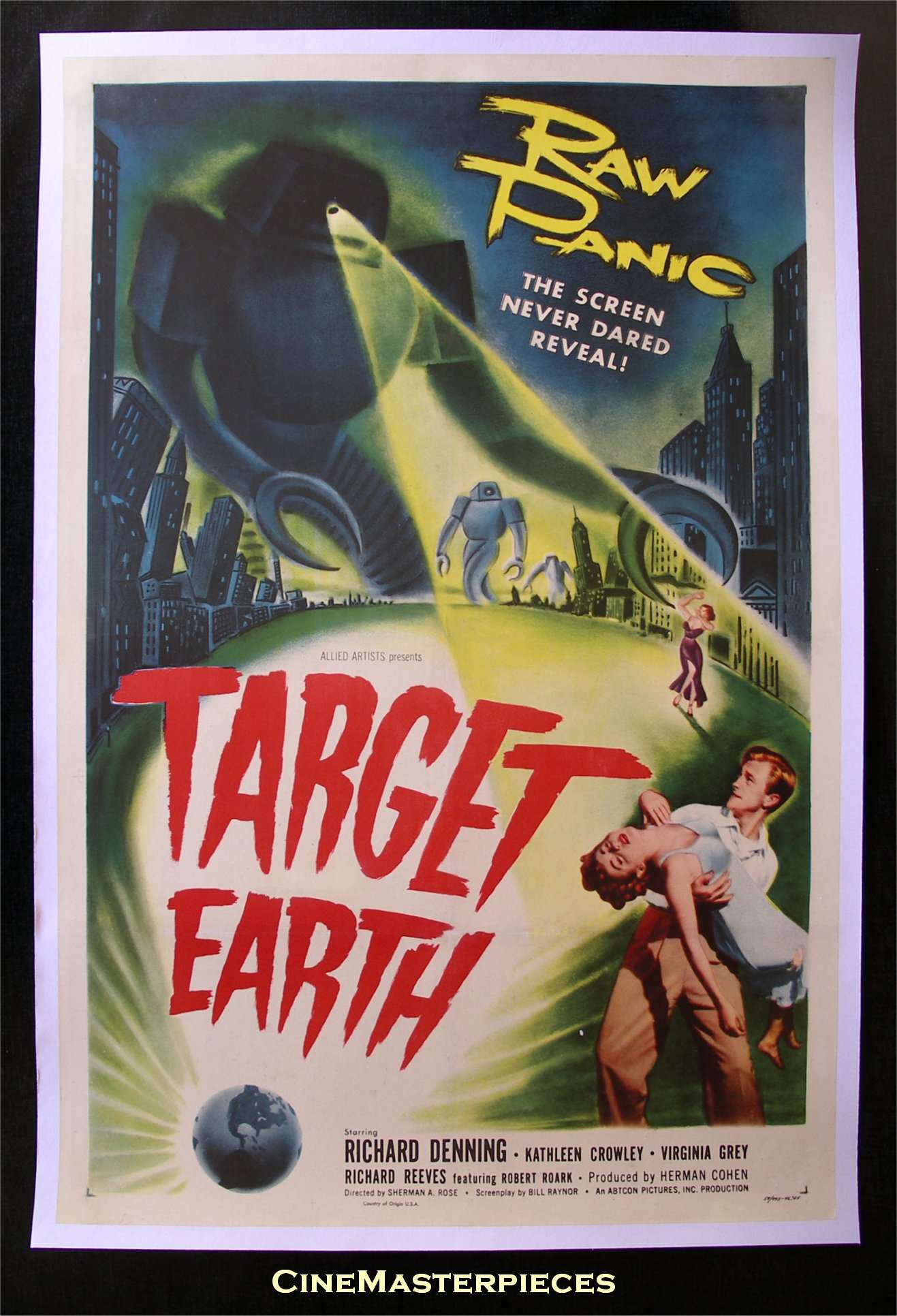
The next poster we are examining is Target Earth. In this poster it still has the frightening monster attacking the people from the the top but this time at the bottom of the post a man is carrying the woman instead of the monster carrying her. It still carries the sense of fear like the previous posters and it works well when seeing a man running to safety with the woman in his arms.
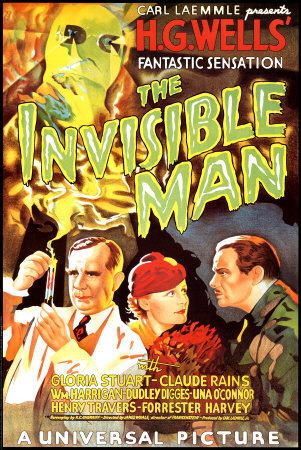
The next poster is very different from the other posters but it still has some of the same characteristics, like the monster at the top and the casts at the bottom, but if you pay attention to how the poster is layered out you can see a trail of smoke coming from the test tube hinting out who is the monster and whats going to happen. Instead of being an invasion film it comes off as an experiment gone wrong film.
The last poster we are viewing is The Quatermass Xperiment poster. This one is very simple, its has a collage of paper, the colours are solid and the writing is simple as well. All of it is simple and yet I believe it still has a spooky appearance with the eye staring at you and how the circle is highlighting the figure with red you can't help but sense a hint of danger from it.

By looking at the poster I now got some understanding of creating our own 1950s poster, by giving the monster a larger than life feel and using the right colours giving it the scary appearance and an attractiveness to lure the audience in to watching our film.
No comments:
Post a Comment